Reselling Norton in Yahoo Property
The current Yahoo purchase checkout interface is functional but not optimal. Requiring users to sign in before navigating to the checkout makes the process more challenging, and a lengthy checkout page increases the likelihood of users abandoning their purchases. The lack of clear guidance on payment options and a summary of the purchased items is also suboptimal. Our goal is to streamline the user experience, enabling quick product purchases directly from the product landing page to minimize subscription time.
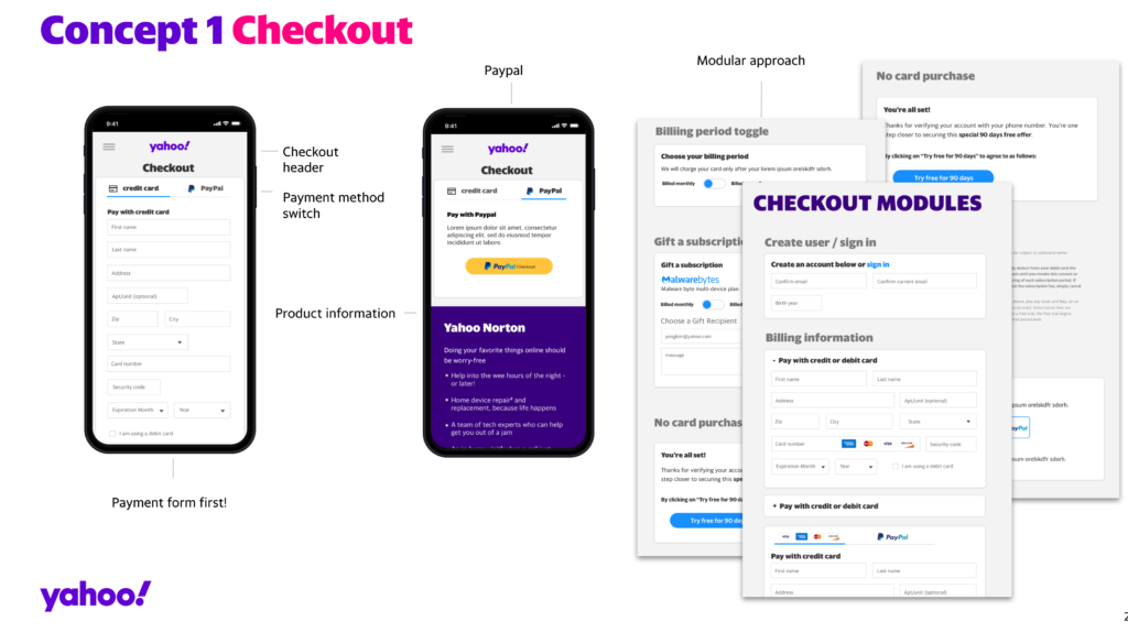
New design concept
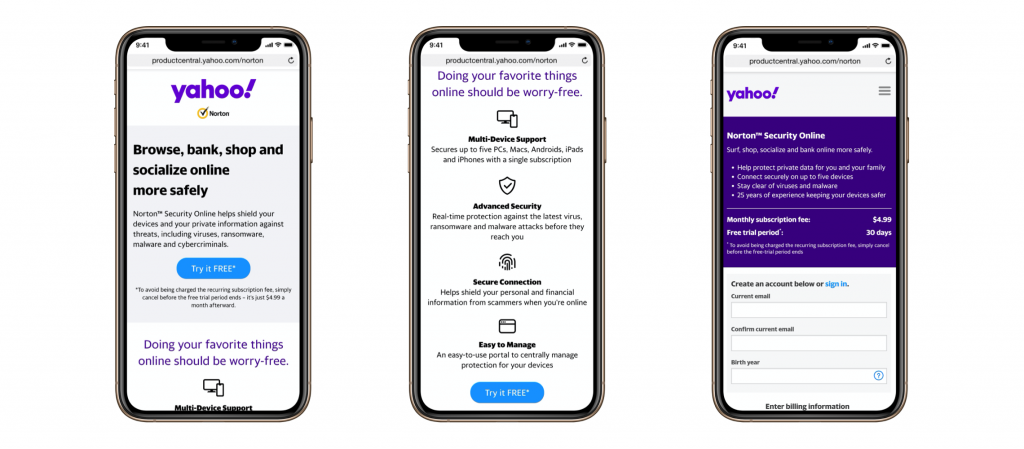
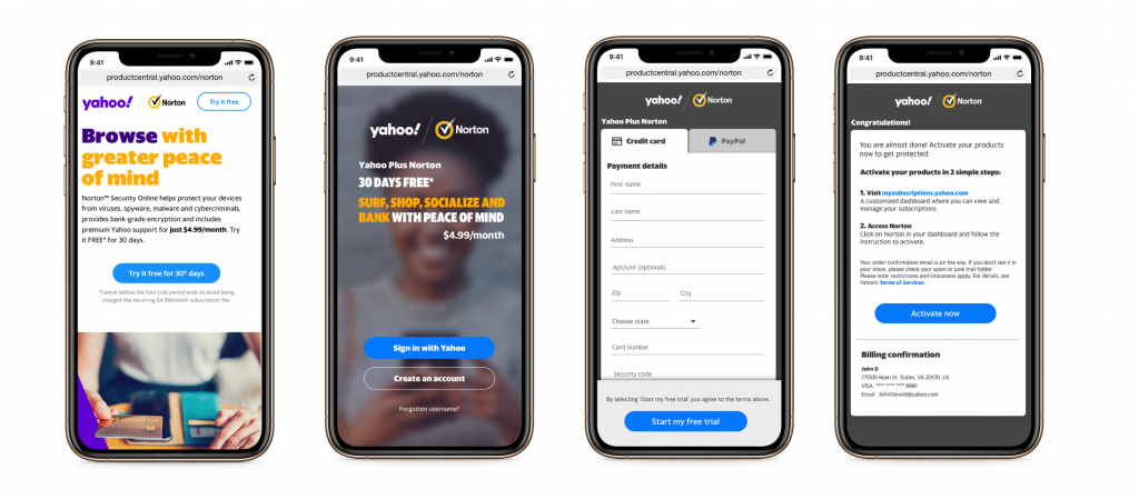
The design mentioned above offered scant information about the product, falling short of adequately informing the consumer about its attributes. Additionally, during the sign-in process, it repeatedly displayed the product headline to notify the user of their purchase. Incorporating statements that articulate why a consumer should choose to purchase Norton from Yahoo and outlining the benefits of acquiring the product is crucial. Furthermore, building trust in our product from the consumer’s standpoint is of paramount importance. Streamlining the checkout process with various payment methods provides users with better choices. The confirmation step assures the user of their purchase details and billing information.
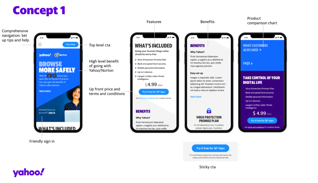
In close collaboration with the product managers, I engaged in numerous iterations of ideas and concepts to address the aforementioned challenges. The paramount objective of our website is to yield tangible outcomes: to drive conversions and bolster sales, encompassing transactions, leads, checkouts, and other pivotal metrics aligned with our objectives.
Prototype for the sign in process
Employing a tool called Protopie, I developed a straightforward prototype for practical demonstration. The pivotal step now is to execute A/B tests to evaluate the viability of this concept and subsequently implement refinements to the existing purchase flow.
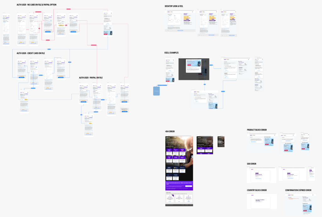
Some screenshots


checkout page 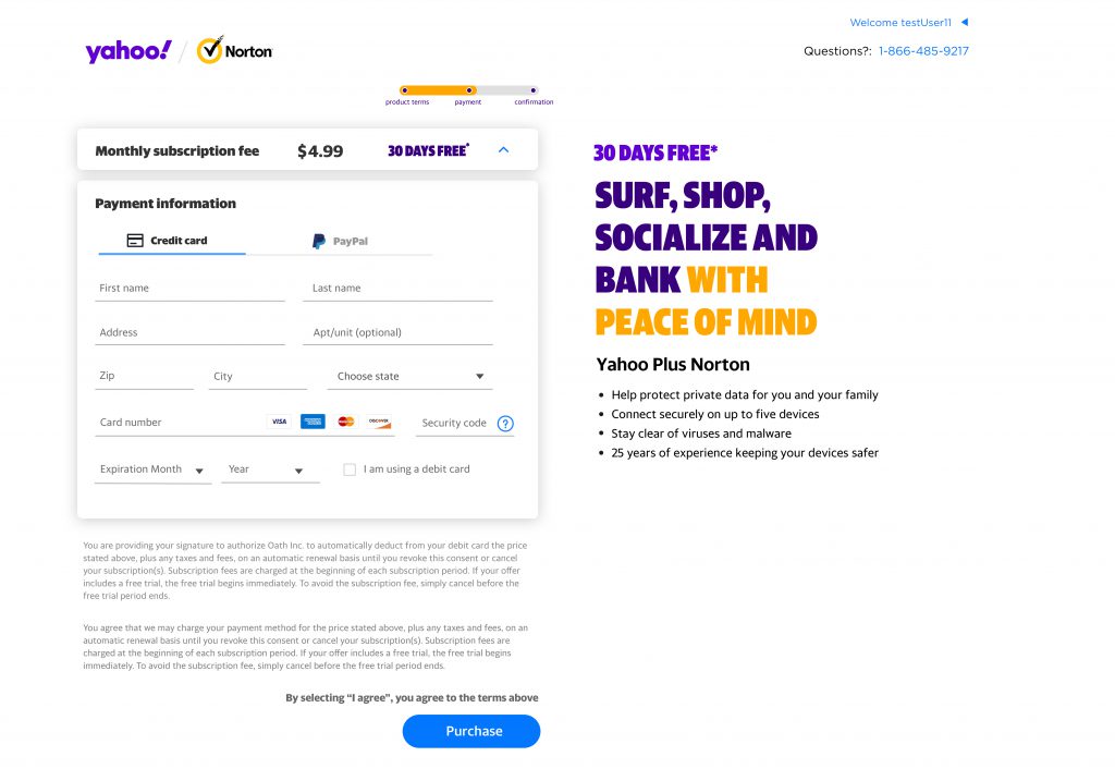
checkout on desktop 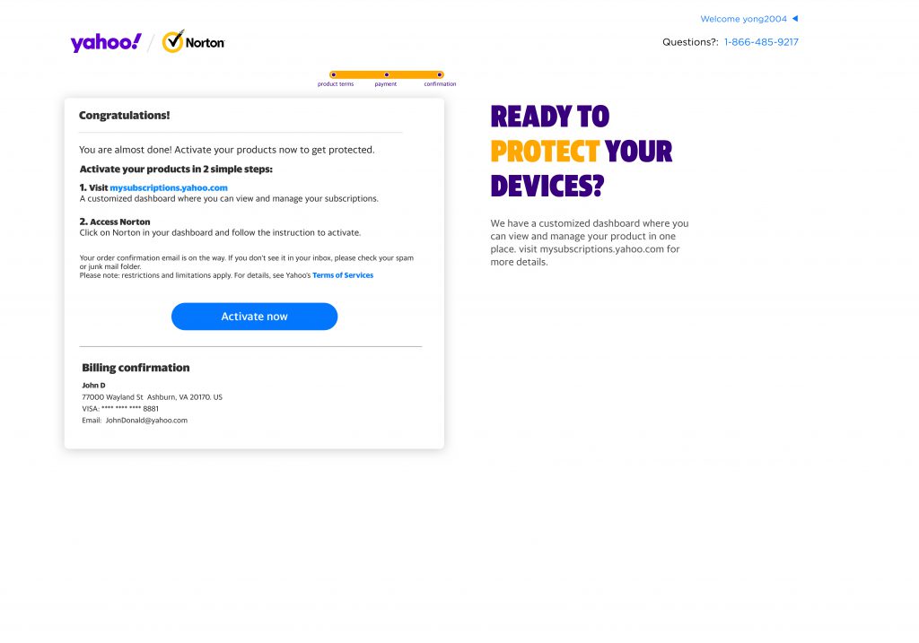
confirmation checkout on mobile 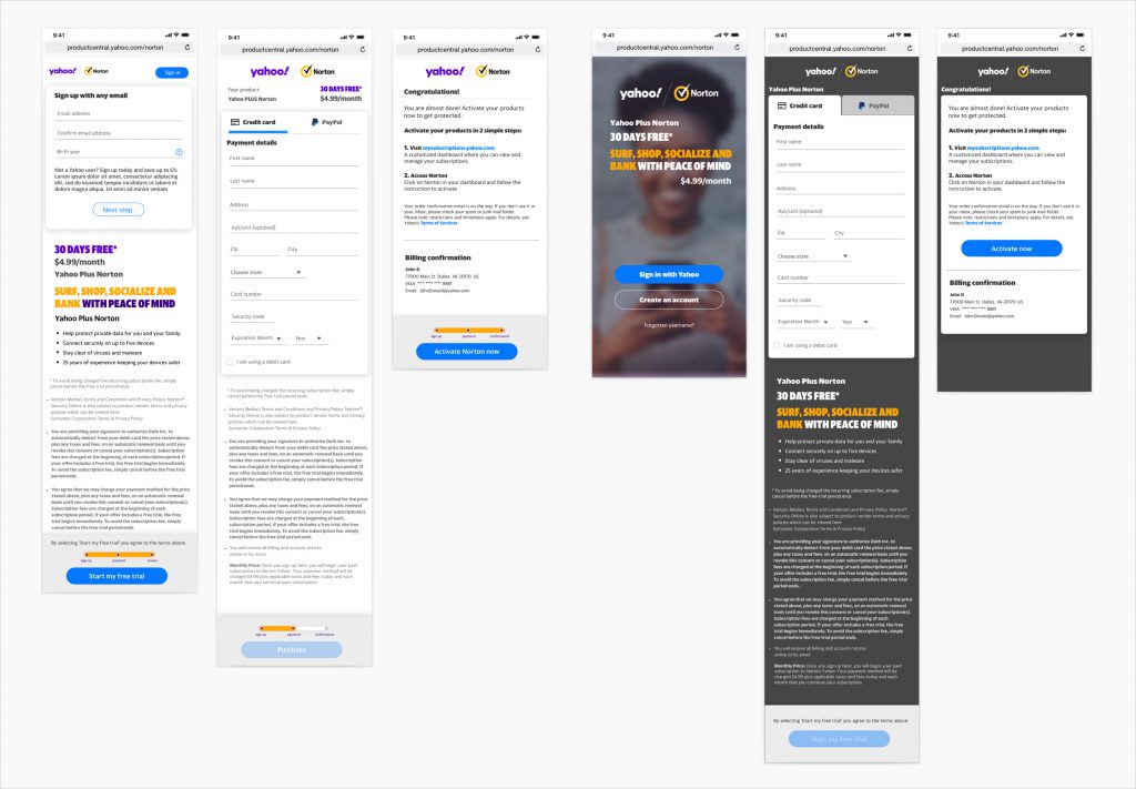

A/B testing concepts video
This video showcases three concepts for a multivariate test.